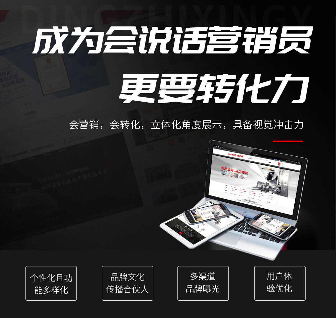
,在不同设备上使用类似的设计
, using similar designs on different devices
用户可以通过不同类型的设备访问您的网站,包括电脑,平板电脑,手机,音乐播放器,甚至智能手表。无论用户使用什么设备访问您的网页,确保他们拥有相似的体验是用户体验设计的重要标准。
Users can access your website through different types of devices, including computers, tablets, mobile phones, music players, and even smart watches. No matter what devices users use to access your web page, ensuring that they have a similar experience is an important standard of user experience design.
2.导航设计应易于使用和清晰
2. The navigation design should be easy to use and clear
导航设计是网页可用性的基石。请记住,如果用户无法在您的网站上找到导航,那么无论您的网站有多少无用。这就是为什么导航设计应遵循以下原则:
Navigation design is the cornerstone of web usability. Remember, if users can't find navigation on your site, no matter how useless your site is. This is why navigation design should follow the following principles:
简单。每个网站都应该有尽可能简单的结构。
Simple. Every website should have as simple a structure as possible.
明确。每个导航项目都应该对用户清楚。
to make clear. Every navigation item should be clear to the user.
是一致的。系统的导航页面应该在每个页面上都相同。
It's consistent. The navigation page of the system should be the same on each page.
用户以少的点击次数访问他们想浏览快的网页。这是导航设计的目的。
Users visit the fastest web page they want to browse with the least number of clicks. This is the purpose of navigation design.
3,改变访问过的链接的颜色
3. Change the color of the visited links
链接是导航的关键因素。如果用户点击链接而不更改颜色,则很可能会导致用户多次点击相同的链接。
Links are a key factor in navigation. If the user clicks on the link without changing the color, it is likely to cause the user to click on the same link more than once.
如果用户知道他过去访问过的链接以及他还没有访问过的链接,那么用户更容易决定下次点击什么。
If the user knows the links he has visited in the past and the links he has not visited, it is easier for the user to decide what to click next.
4,使页面浏览更容易
4. Make page browsing easier
当用户浏览我们的网页时,他们不会阅读所有内容,而是快速浏览整个网页。因此,如果用户访问该站点以查找特定内容或完成任务,他们将浏览整个页面,直到用户找到他们想要去的地方。因此,作为网页设计师,我们应该通过设计网站可视化的分层结构来帮助这些用户尽快实现他们的目标。视觉层次意味着每个元素在网页上的放置或展示都是加权的(例如,我们的设计确定用户看到哪一个,他们看到哪一个,以及他们后看到哪一个)。
When users browse our website, they don't read all the content, but quickly browse the whole page. Therefore, if users visit the site to find specific content or complete tasks, they will first browse the entire page until they find where they want to go. Therefore, as a web designer, we should help these users achieve their goals as soon as possible by designing a visual hierarchical structure of the website. Visual hierarchy means that the placement or presentation of each element on a web page is weighted (for example, our design determines which users see first, which they see, and which they see last).
在设计网站时,我们需要确保页面标题,登录注册按钮,导航栏或其他同等重要的元素放置在用户可以轻松看到的位置,以减少用户寻找的时间。
When designing a website, we need to make sure that the page title, login registration button, navigation bar or other equally important elements are placed in a position that users can easily see, so as to reduce the time for users to search.
用户的视线是锯齿形的。
The user's line of sight is zigzag.
5,仔细检查所有链接
5. Check all links carefully
当用户点击网站上的链接并在屏幕上出现404错误页面时,用户可能很容易感到沮丧,当用户在网站上查找内容时,他们希望他们点击的每个链接成为他们正在查找的链接,而不是404错误页面,或者点击并找到他们不想查找的页面。
When users click on a link on a website and a 404 error page appears on the screen, they may easily feel frustrated. When users search for content on a website, they want each link they click to become a link they are looking for instead of a 404 error page, or they click and find a page they don't want to look for.
6.确保可点击元素使用户看起来像点击一样
6. Make sure that the clickable elements make the user look like a click
对象的外观告诉用户如何使用它。看起来像按钮或链接的视觉元素不能被点击,并且很容易让用户感到困惑。这些视觉元素包括:文字下划线不代表链接,动画元素或超链接。用户想知道界面的哪些区域是纯粹的静态内容以及哪些区域是可点击的。
The appearance of the object tells the user how to use it. Visual elements that look like buttons or links cannot be clicked and can easily confuse users. These visual elements include: text underscores do not represent links, animation elements or hyperlinks. Users want to know which areas of the interface are purely static and which are clickable.


 727671696
 15508684333
 在线留言
在线留言