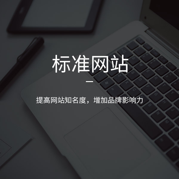
架构
framework
这个网站的主页是一个战场。每个频道的所有者都希望在显著位置推荐他的产品或信息,以增加他的曝光率。他总是想让用户一次看到所有东西,但终我们发现,你放入的东西越多,用户找到他们想要的东西的可能性就越小,很快就会离开。门户网站已经习惯了更多的信息,页面长度,所有的东西都要放到主页堆栈上,感觉越多的内容就会显示出越多的气氛,但是用户的耐心是有限的,所以网站的渗透性对于国内网站来说非常重要,每个屏幕不应该改变太多,只要是适当的,而且主要和次要的内容应该放置在一致的方式,否则用户每次移动到下一个屏幕都必须重新阅读结构,并且考虑从哪里开始,不仅用户的耐心会被消耗,而且会增加用户的浏览成本,所以网站主页结构必须清晰,保持良好的透明度,。
The home page of this website is a battlefield. The owner of each channel wants to recommend his products or information in a prominent position to increase his exposure. He always wants users to see everything at once, but finally we find that the more things you put in, the less likely users are to find what they want, and they will leave soon. Portal websites are used to putting more information, page length and everything on the home page stack. It feels that the more content will show the more atmosphere, but users' patience is limited. Therefore, the permeability of the website is very important for domestic websites. Each screen should not be changed too much, as long as it is appropriate, Moreover, the primary and secondary contents should be placed in the same way, otherwise the user must re read the structure every time he moves to the next screen, and consider where to start, which will not only consume the user's patience, but also increase the user's browsing cost. Therefore, the main page structure of the website must be clear and maintain good transparency,.
风格
style
如果可以用一行显示效果,就不需要用两行。如果能用文字表达清楚,就不需要图片了。如果页面设计中使用过多的装饰元素,页面会很庞大,下载速度也会很慢。不要高估网友的耐心。
If you can use one line to display the effect, you don't need two lines. If you can express it clearly in words, you don't need pictures. If too many decorative elements are used in the page design, the page will be very large and the download speed will be very slow. Don't overestimate the patience of netizens.
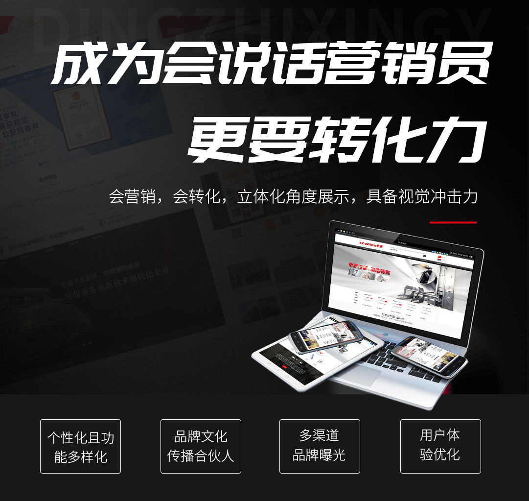
大部分网友都不耐烦了。在浏览大量信息时,需要一个简单、畅通的界面。过多的颜色和装饰会分散用户的注意力,影响用户的浏览效果,减少用户对信息的点击。一个网站需要用户看到的是网站提供的信息内容和服务,而不是花里胡哨的装饰品(个性化产品网站除外)。
Most netizens are impatient. When browsing a large amount of information, you need a simple and smooth interface. Too many colors and decorations will distract users' attention, affect users' browsing effect and reduce users' clicks on information. A website needs users to see the information content and services provided by the website, not fancy decorations (except personalized product websites).
信息排布
Information layout
网站系统首页一般企业都会承载大量的资讯管理信息,密密麻麻的信息会让用户可以浏览网页的时候会产生压迫感,如何能让学生用户顺畅的浏览成为我们网站结构设计中重要的一环。
The home page of the website system generally carries a large amount of information management information. The dense information will make users feel oppressive when they can browse the web page. How to make student users browse smoothly has become an important part of our website structure design.
视觉顺序
Visual order
在一个信息版块里,会有视觉区、第二视觉区、第三视觉区,就是说当用户看到这一信息版块时眼会落到图片的位置,第2眼会落到大标题上,第3眼会落到其他地方。这样有顺序的引导用户浏览,可减少用户的浏览成本,增加页面的视觉效果。
In an information section, there will be a first visual area, a second visual area and a third visual area, that is, when users see this information section, the first eye will fall to the position of the picture, the second eye will fall to the headline, and the third eye will fall to other places. In this way, users can be guided to browse in order, which can reduce users' browsing cost and increase the visual effect of the page.
在这个信息版块里第1视觉和第2视觉有可能会因为选材方面而转换视觉,按常理图型视觉冲击力是大于文字的,但当选用的图片素材不优的时候也会被文字所吸引过去。
In this information section, the first vision and the second vision may change vision due to material selection. According to the common sense, the visual impact of the pattern is greater than that of the text, but when the selected picture material is not excellent, it will also be attracted by the text.


 727671696
 15508684333
 在线留言
在线留言