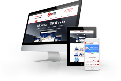
随着移动设备的普及,越来越多的用户使用手机和平板电脑来访问网站。因此,网站制作中的响应式设计和移动端优化变得越来越重要。这里
济南网站开发公司小编将介绍响应式设计和移动端优化的概念以及如何在网站制作中应用它们。
With the popularity of mobile devices, more and more users are using their phones and tablets to access websites. Therefore, responsive design and mobile optimization in website production have become increasingly important. Here, the editor of Jinan website development company will introduce the concepts of responsive design and mobile optimization, as well as how to apply them in website production.
一、响应式设计
1、 Responsive design
响应式设计是指网站能够根据不同的设备和屏幕大小自动调整布局和内容的设计方法。响应式设计可以让网站在不同的设备上都能够提供佳的用户体验,无论是在桌面电脑、平板电脑还是手机上。
Responsive design refers to the design method in which a website can automatically adjust its layout and content based on different devices and screen sizes. Responsive design allows websites to provide a great user experience on different devices, whether it's on desktops, tablets, or phones.
响应式设计的实现需要使用CSS媒体查询和弹性网格布局等技术。通过CSS媒体查询,可以检测设备的屏幕大小和分辨率,并根据不同的条件应用不同的CSS样式。弹性网格布局可以让网站的布局自适应不同的屏幕大小,从而保证网站在不同的设备上都能够提供好的用户体验。
The implementation of responsive design requires the use of technologies such as CSS media queries and elastic grid layout. By querying through CSS media, the screen size and resolution of the device can be detected, and different CSS styles can be applied according to different conditions. Elastic grid layout can adapt the layout of a website to different screen sizes, ensuring that the website can provide a good user experience on different devices.
二、移动端优化
2、 Mobile optimization
移动端优化是指针对移动设备的特点和用户行为进行的网站优化。移动设备的屏幕较小,网络速度较慢,用户行为也与桌面电脑有所不同。因此,在网站制作中需要针对这些特点进行优化,以提供佳的用户体验。
Mobile optimization refers to website optimization based on the characteristics and user behavior of mobile devices. Mobile devices have smaller screens, slower network speeds, and different user behaviors compared to desktop computers. Therefore, in website production, it is necessary to optimize these characteristics to provide a better user experience.
移动端优化的具体方法包括:
The specific methods for optimizing mobile devices include:
1.压缩图片和文件大小,以提高网站的加载速度。
1. Compress images and file sizes to improve website loading speed.
2.使用简洁的设计和布局,以适应移动设备的屏幕大小。
2. Use concise design and layout to adapt to the screen size of mobile devices.
3.使用大号字体和简洁的文本,以提高移动设备上的可读性。
3. Use large fonts and concise text to improve readability on mobile devices.
4.使用触摸友好的设计,以适应移动设备的用户行为。
4. Use touch friendly design to adapt to the user behavior of mobile devices.
5.使用移动设备的特性,如GPS、摄像头等,来提供更好的用户体验。
5. Use the characteristics of mobile devices, such as GPS, cameras, etc., to provide a better user experience.
三、如何应用响应式设计和移动端优化
3、 How to apply responsive design and mobile optimization
在网站制作中应用响应式设计和移动端优化需要考虑以下几个方面:
The application of responsive design and mobile optimization in website production needs to consider the following aspects:
1.设计阶段:在设计阶段需要考虑不同设备的屏幕大小和分辨率,以及移动设备的特点和用户行为。设计师需要根据这些因素来设计网站的布局和内容。
1. Design phase: In the design phase, it is necessary to consider the screen size and resolution of different devices, as well as the characteristics and user behavior of mobile devices. Designers need to design the layout and content of a website based on these factors.
2.开发阶段:在开发阶段需要使用CSS媒体查询和弹性网格布局等技术来实现响应式设计。同时,需要对网站进行移动端优化,如压缩图片和文件大小、使用大号字体和简洁的文本等。
2. Development phase: In the development phase, it is necessary to use technologies such as CSS media queries and elastic grid layouts to achieve responsive design. At the same time, it is necessary to optimize the website on the mobile end, such as compressing images and file sizes, using large fonts, and concise text.
3.测试阶段:在测试阶段需要测试网站在不同设备上的表现,包括桌面电脑、平板电脑和手机等。测试人员需要检查网站的布局、内容和功能是否在不同设备上都能够正常显示和使用。
3. Testing phase: During the testing phase, it is necessary to test the performance of the website on different devices, including desktops, tablets, and phones. Testers need to check whether the layout, content, and functionality of the website can be displayed and used normally on different devices.
响应式设计和移动端优化是网站制作中不可或缺的部分。通过应用这些技术,可以提供佳的用户体验,无论是在桌面电脑、平板电脑还是手机上。还有什么问题就来我们网站
http://www.jnzyjz.cn咨询吧!
Responsive design and mobile optimization are indispensable parts of website production. By applying these technologies, a better user experience can be provided, whether on desktop computers, tablets, or mobile phones. If you have any further questions, please come to our website http://www.jnzyjz.cn Consult!


 本网站部分资源来自互联网,如有侵权,请联系我们及时删除.


 727671696
 15508684333
 在线留言
在线留言